MENLO PARK LABS
OBJECTIVE:
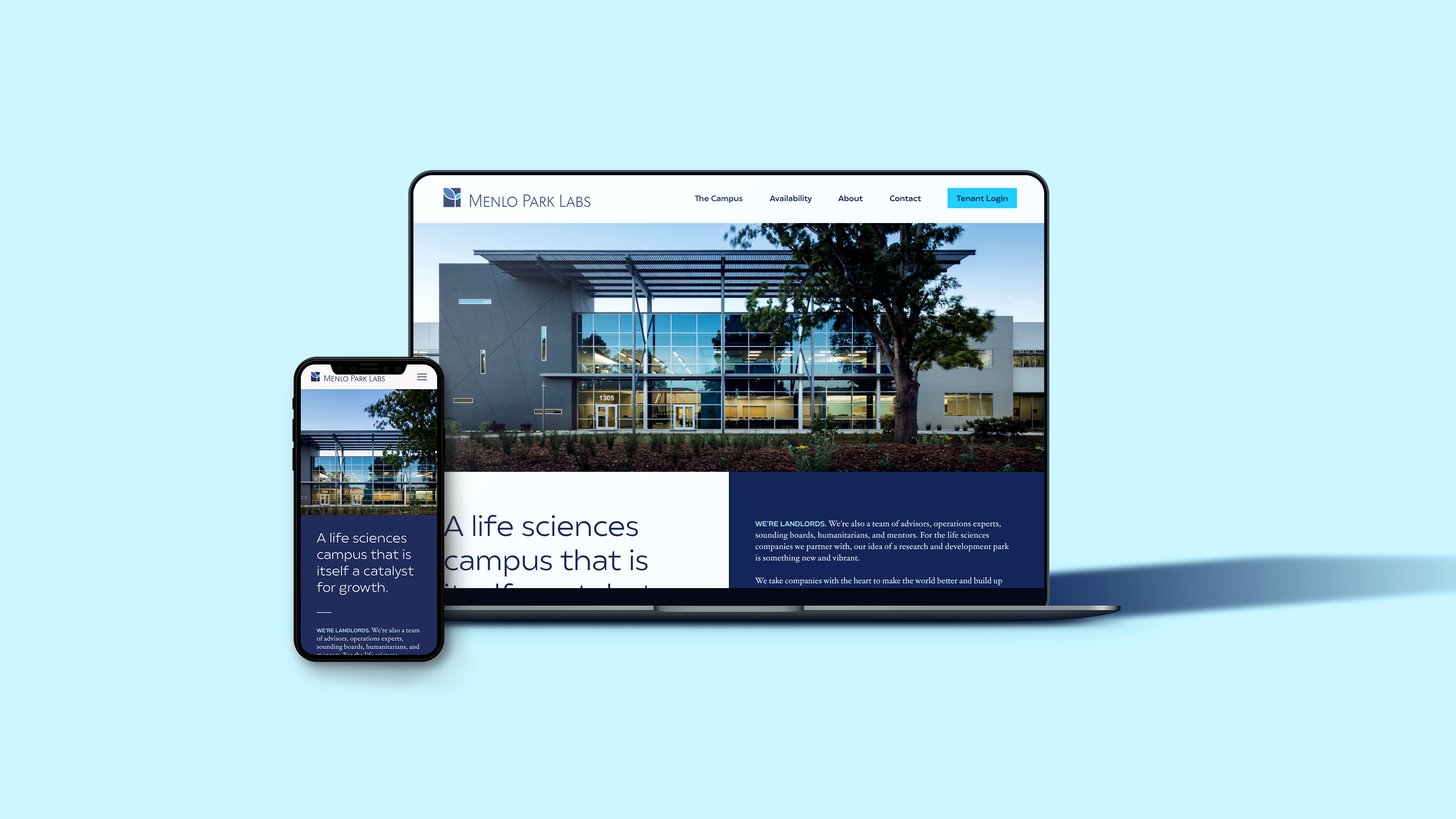
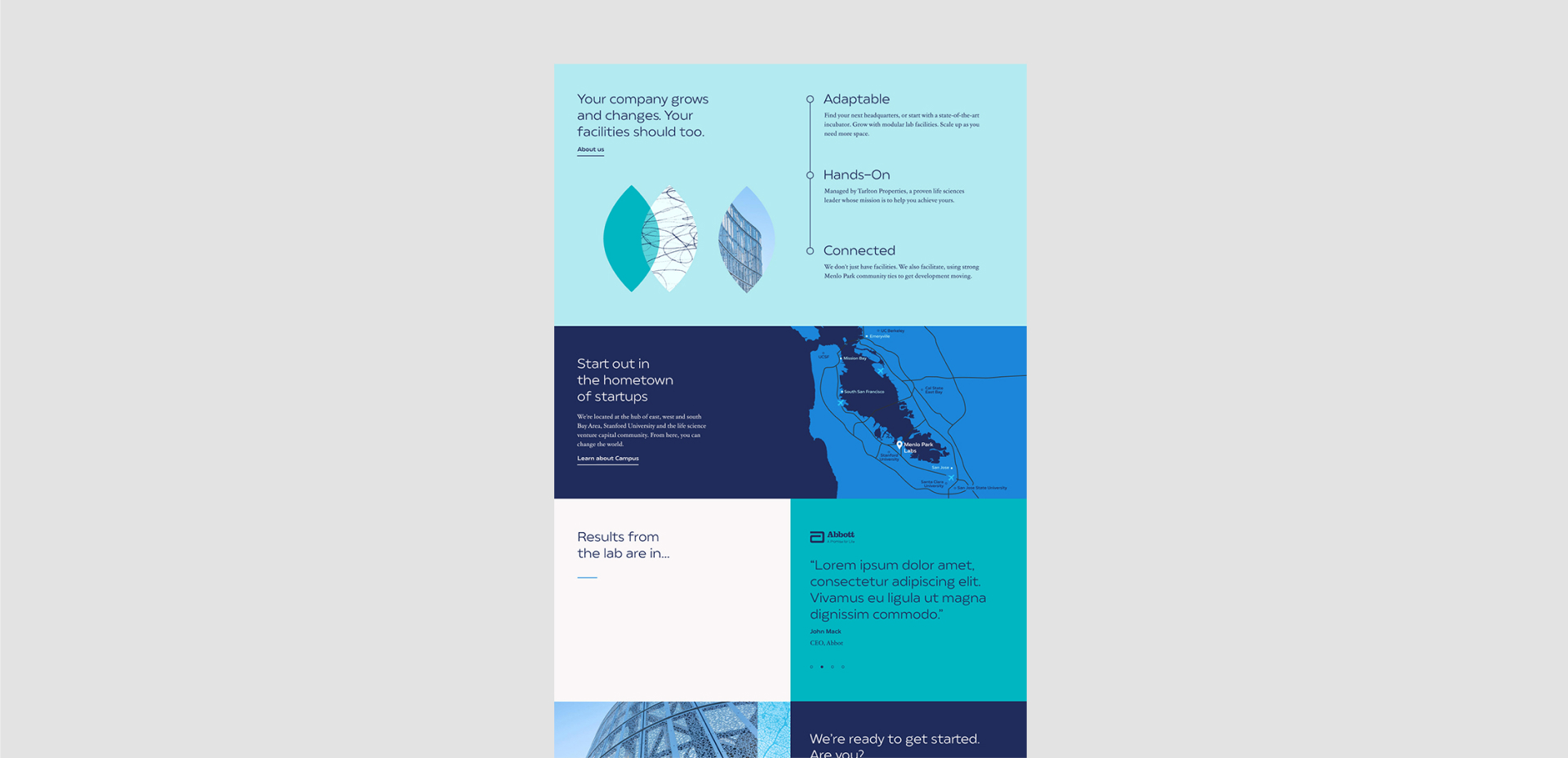
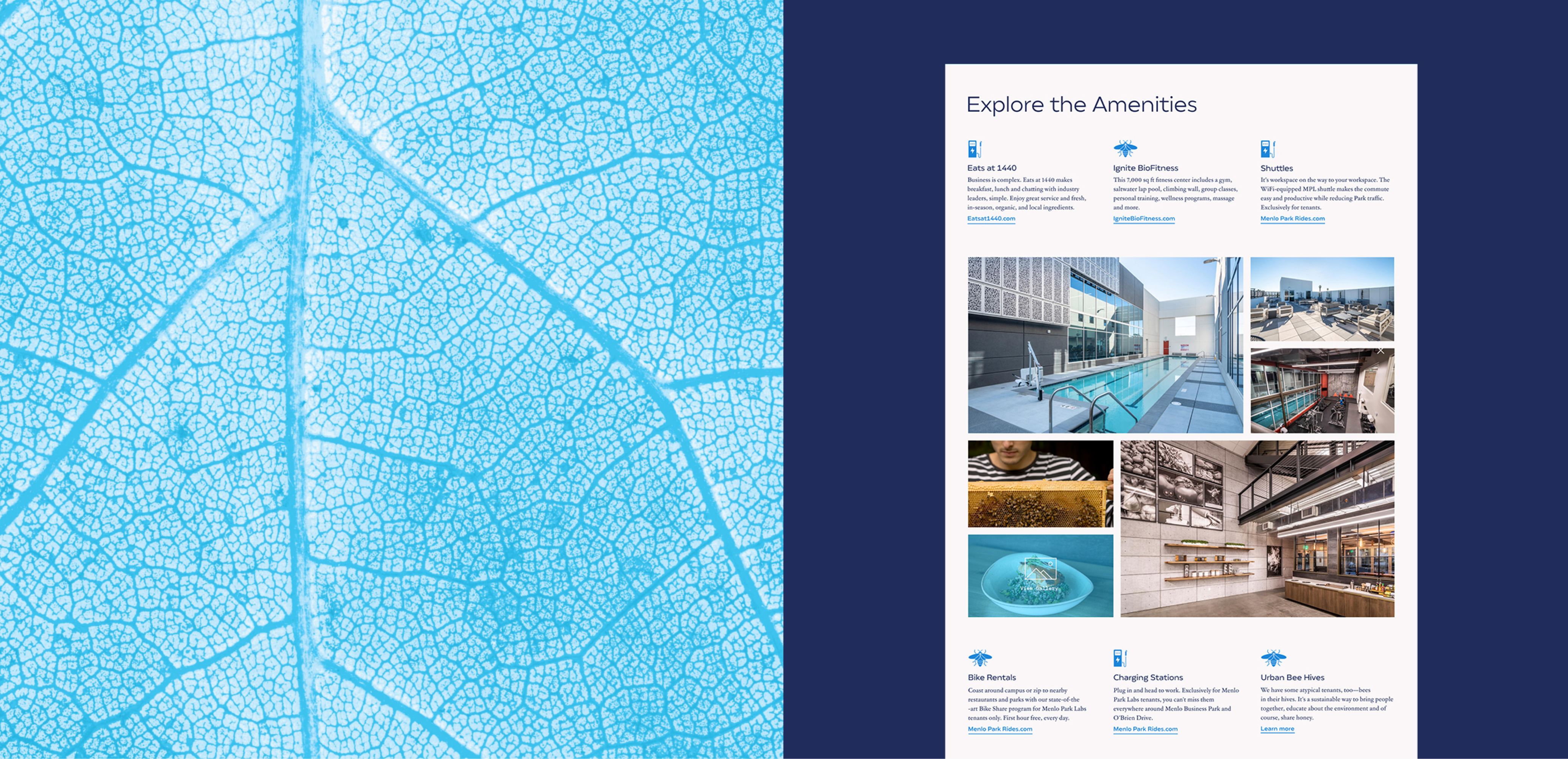
Menlo Park Labs came to the Hub team to help them create a brand based off of their current logo along with a website for investors and potential tenants of their laboratory space in the Bay Area. My team consisted of two CD's and another designer and together we created the Menlo Park Labs look and feel. The client asked for the website to feel like the user was walking through a gallery but not to come off as pretentious or unapproachable.
APPROACH:
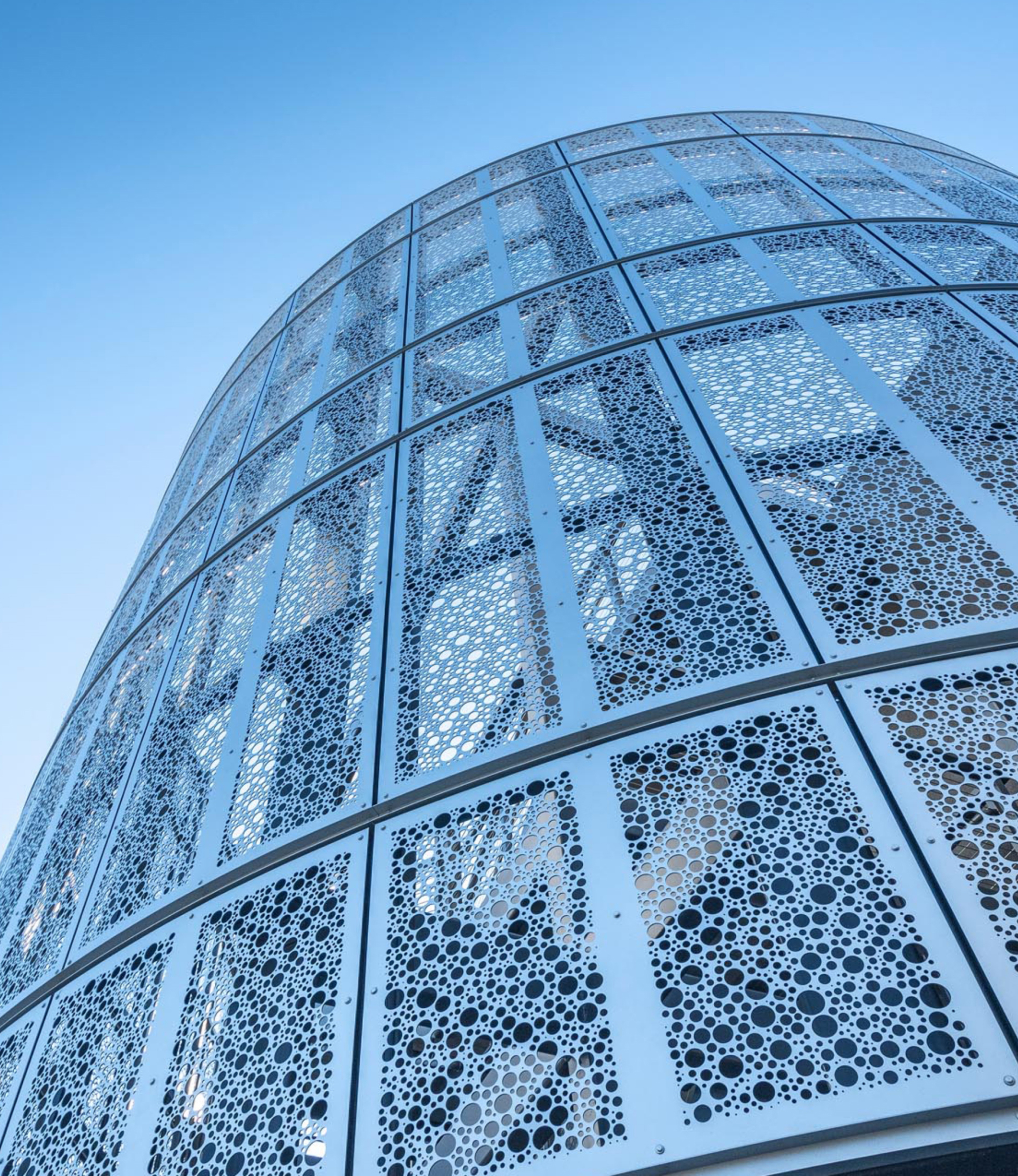
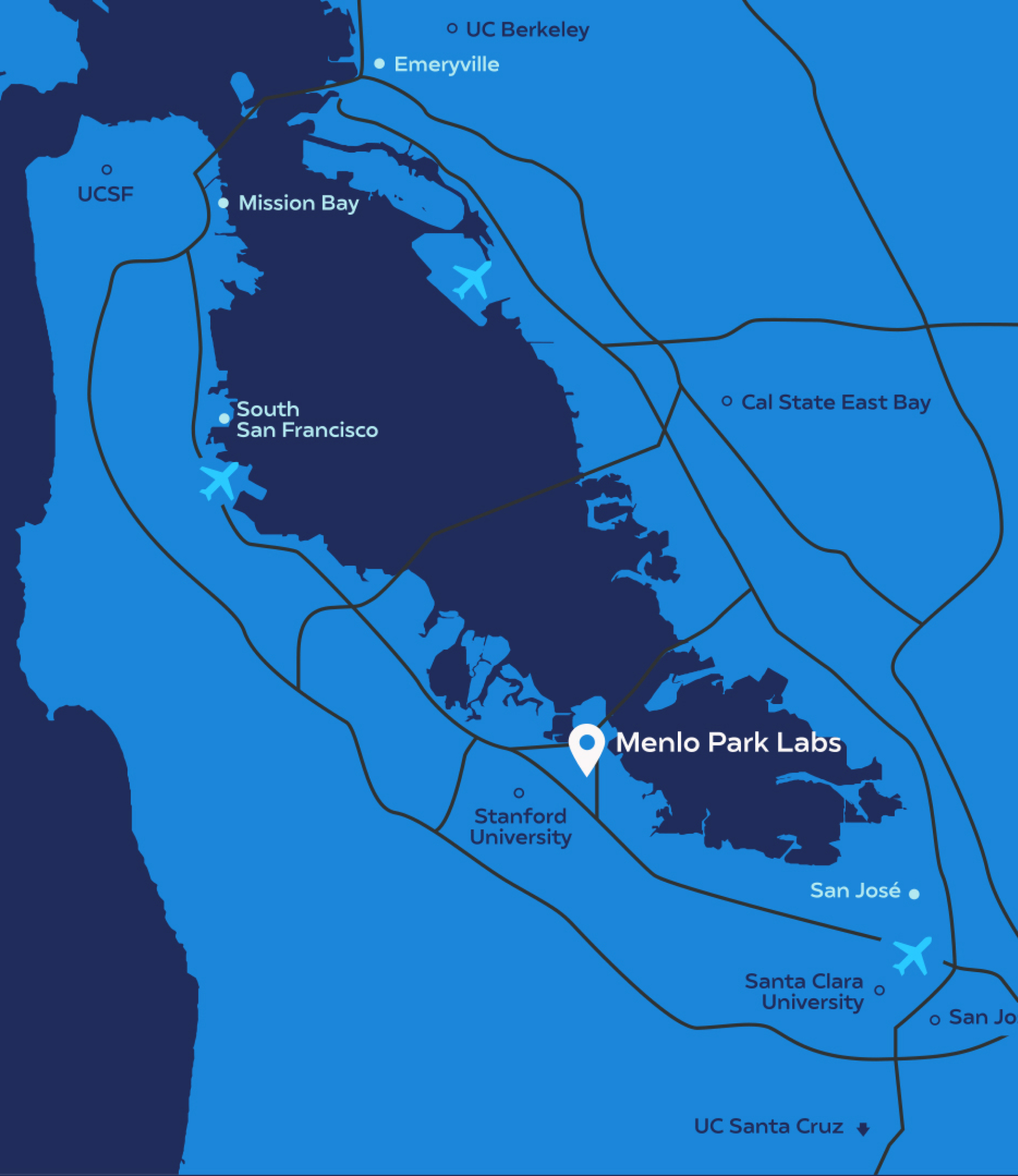
The HUb team worked together to create the color palette based off of the current logo and borrowed the leaf element from the logo as a graphic throughout the site. We also chose to use photos of leaf textures with the blue overlaid as a gradient map to bring in color and emphasize the "bio" in biotech. We chose a font pairing that was safe for web and had a scholarly but natural feel to it.
Role: Designer
Team: Ryan Scheiber, Sam Cush, Jason Rothman, DJ O'Neil, Mark Debiak, Fabio Carretti
Work done at HUb Stratgey & Advertising