MAGICK
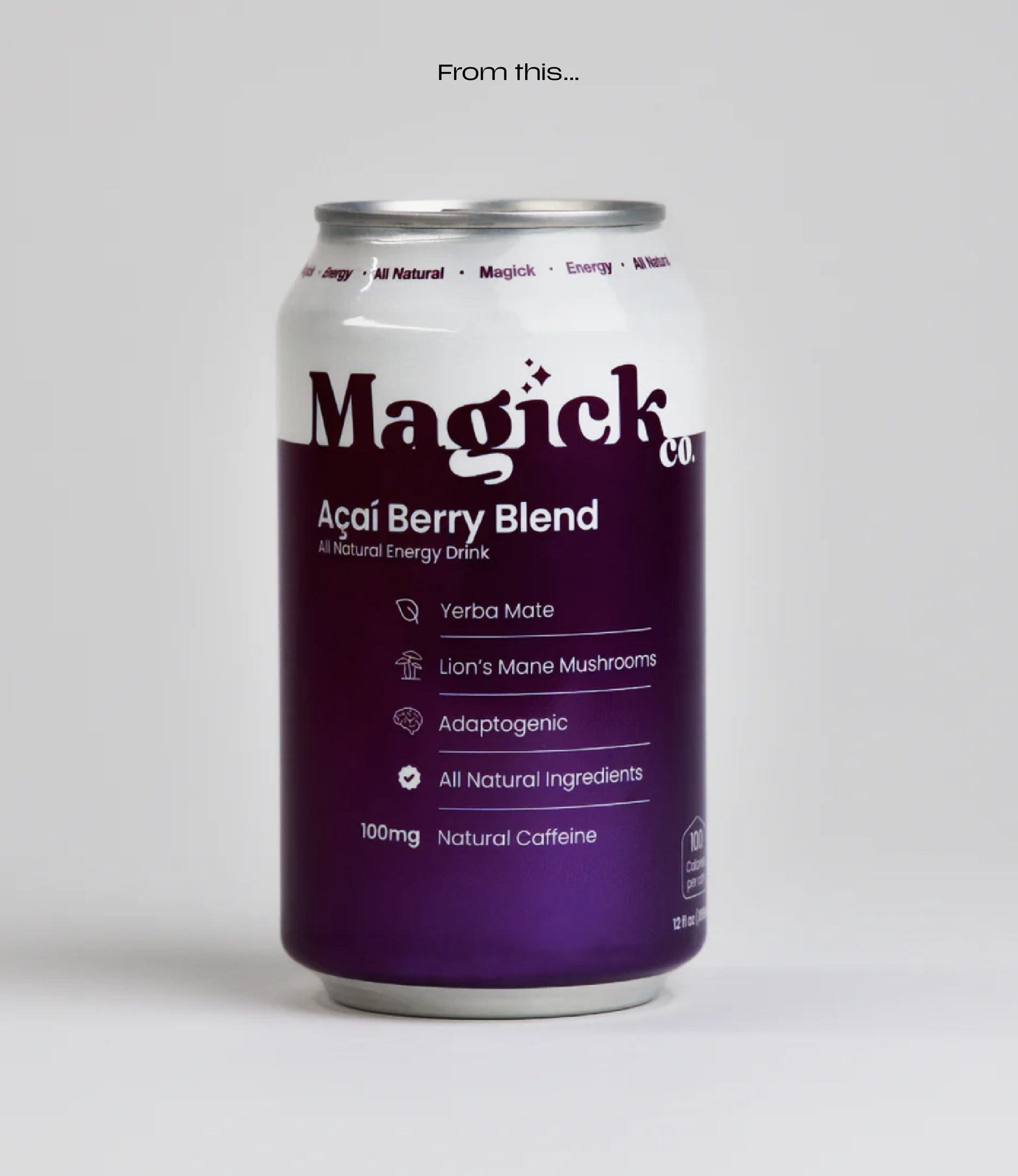
In spring of 2023 while on a ski lift I met a gentleman with green hair who told me about his brand, Magickco, an all natural energy drink for athletes, eccentrics and artists. I was immediately intrigued because that was exactly how I identified myself. “This brand was made for me” I thought. But when I got home and went searched up his brand, I was so disappointed to see a pretty unappealing design that lacked personality and appeal. I took this as an opportunity for myself to reimagine how I would approach this brand to not only better speak to its consumers but also stand out in the market as a healthy alternative to regular chemical-loaded energy drinks.
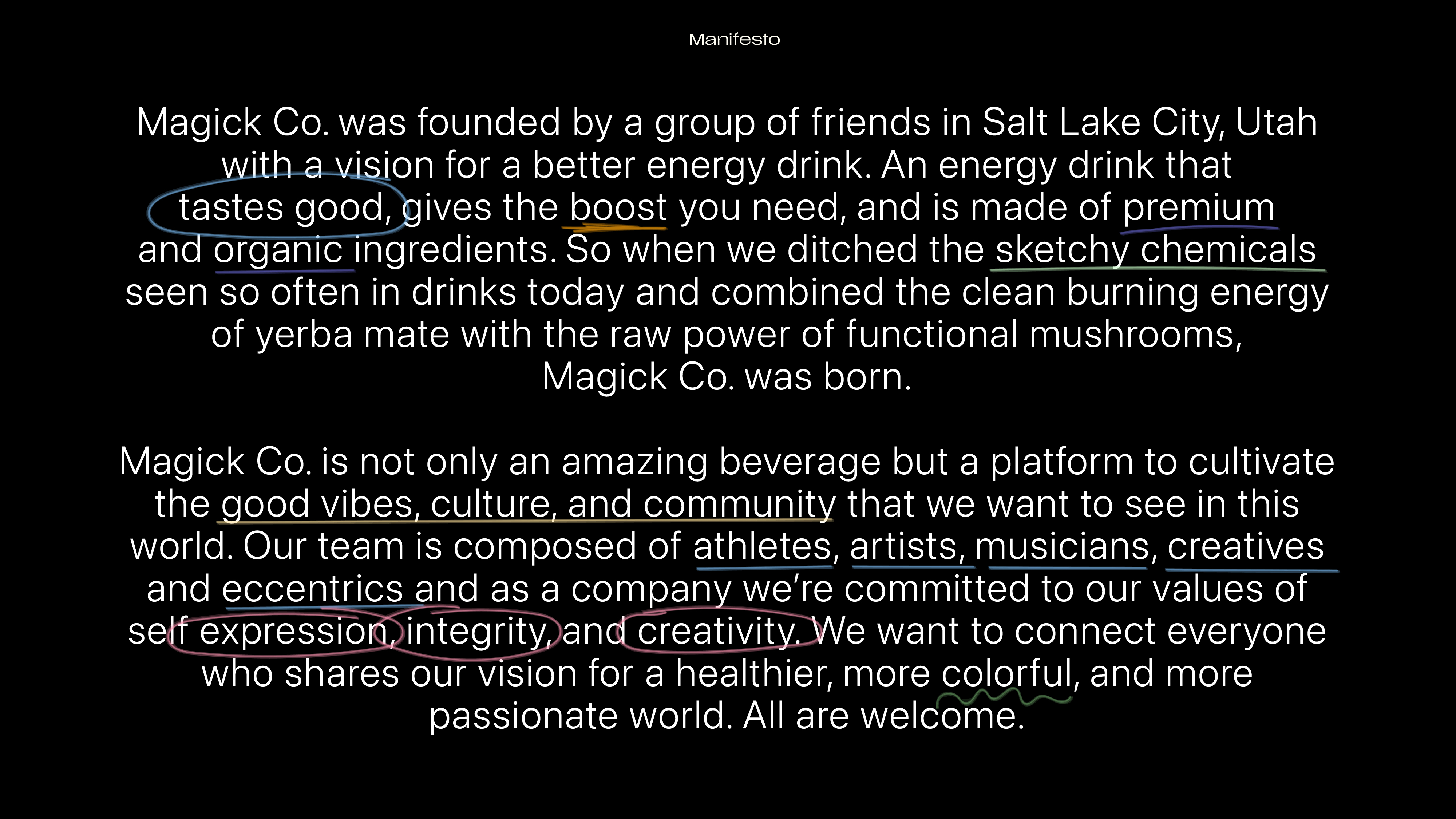
When reading through the manifesto on the about page of Magickco I felt that the ideas written there were pretty strong and held a unique viewpoint and approach, considering not just the energy boost from the drink but the health and wellness properties too. I also loved the messaging about how this brand was created for artists and eccentrics which led me to believe that this can has to be artistic and vibey AF.
Role: Designer, Creative Director, Illustrator
Work done for Personal Use
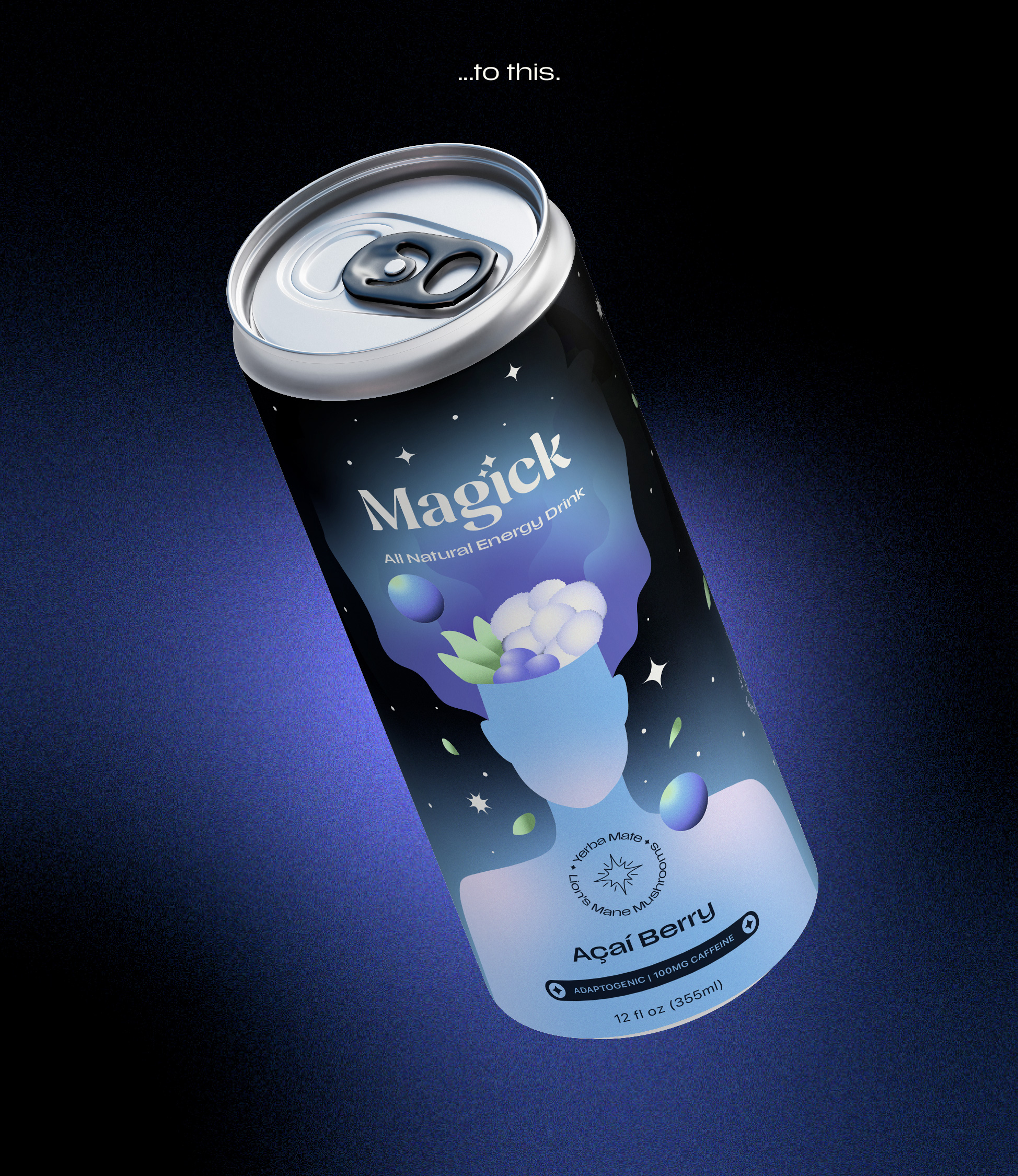
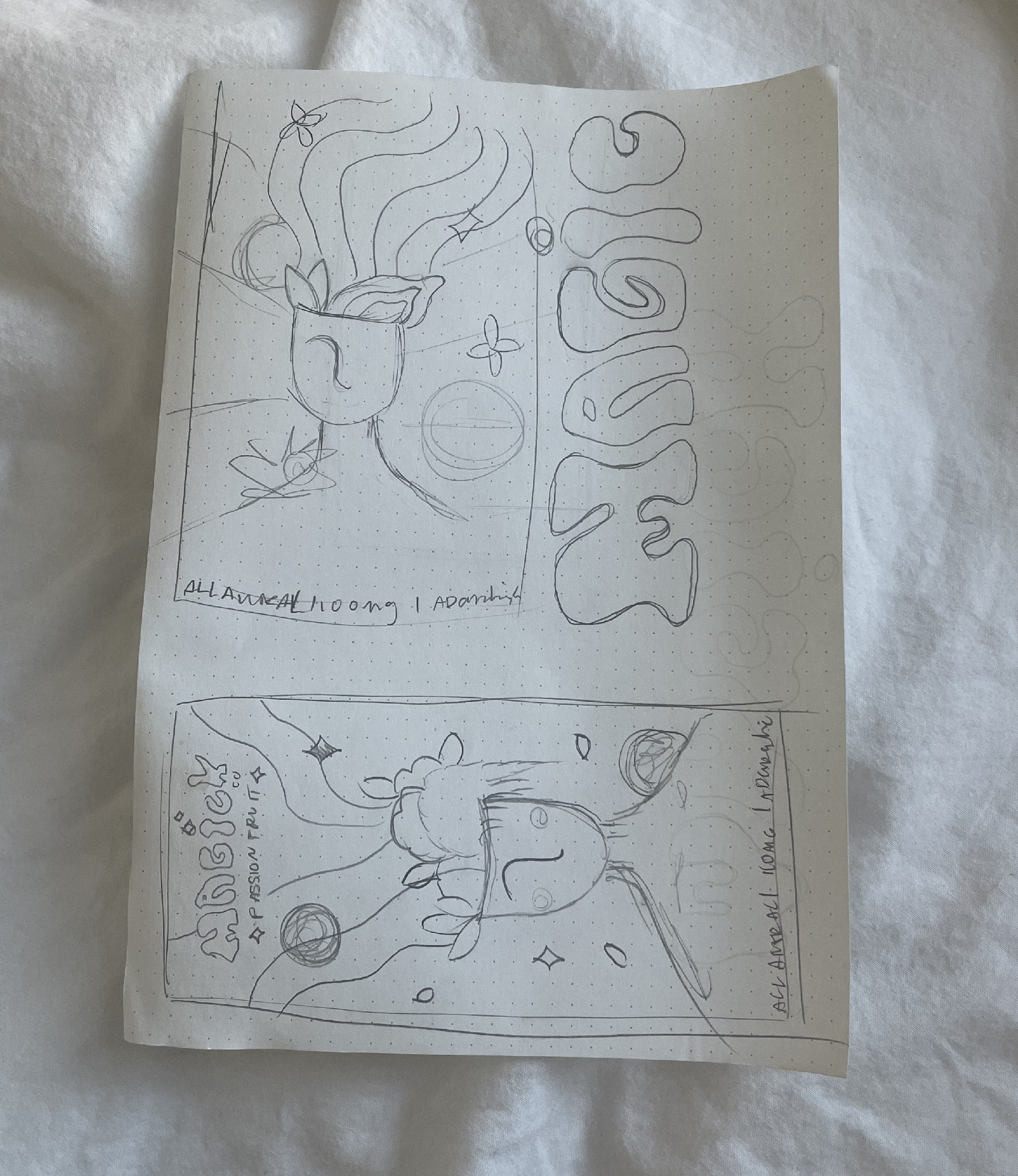
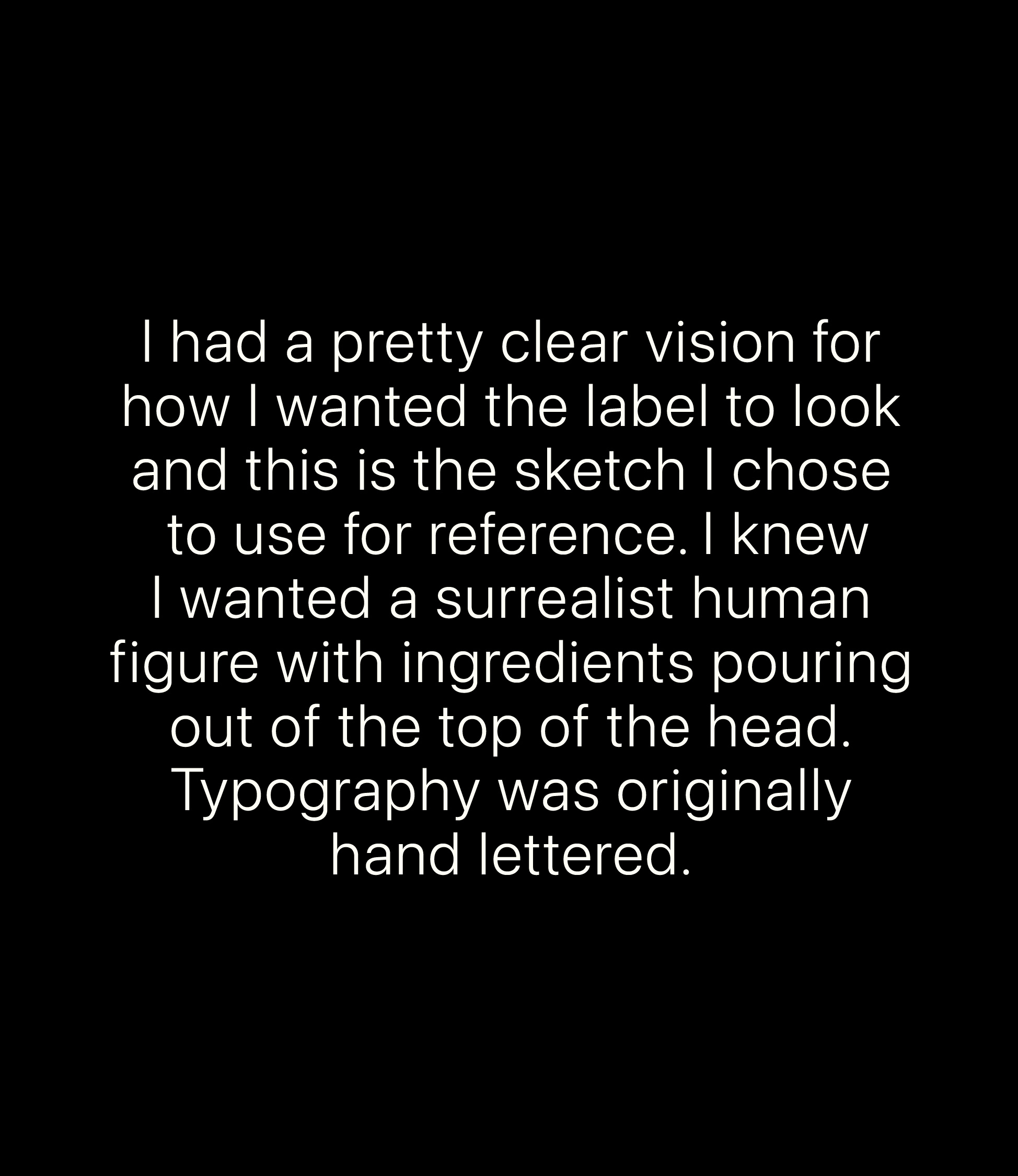
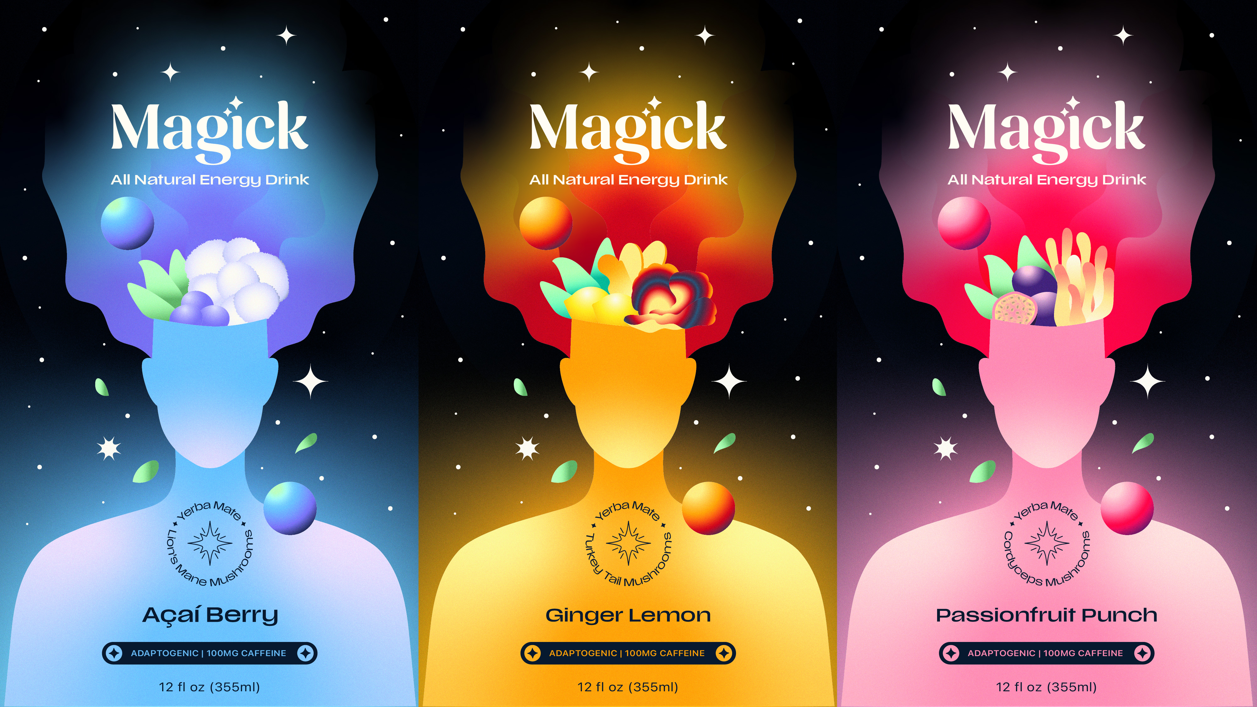
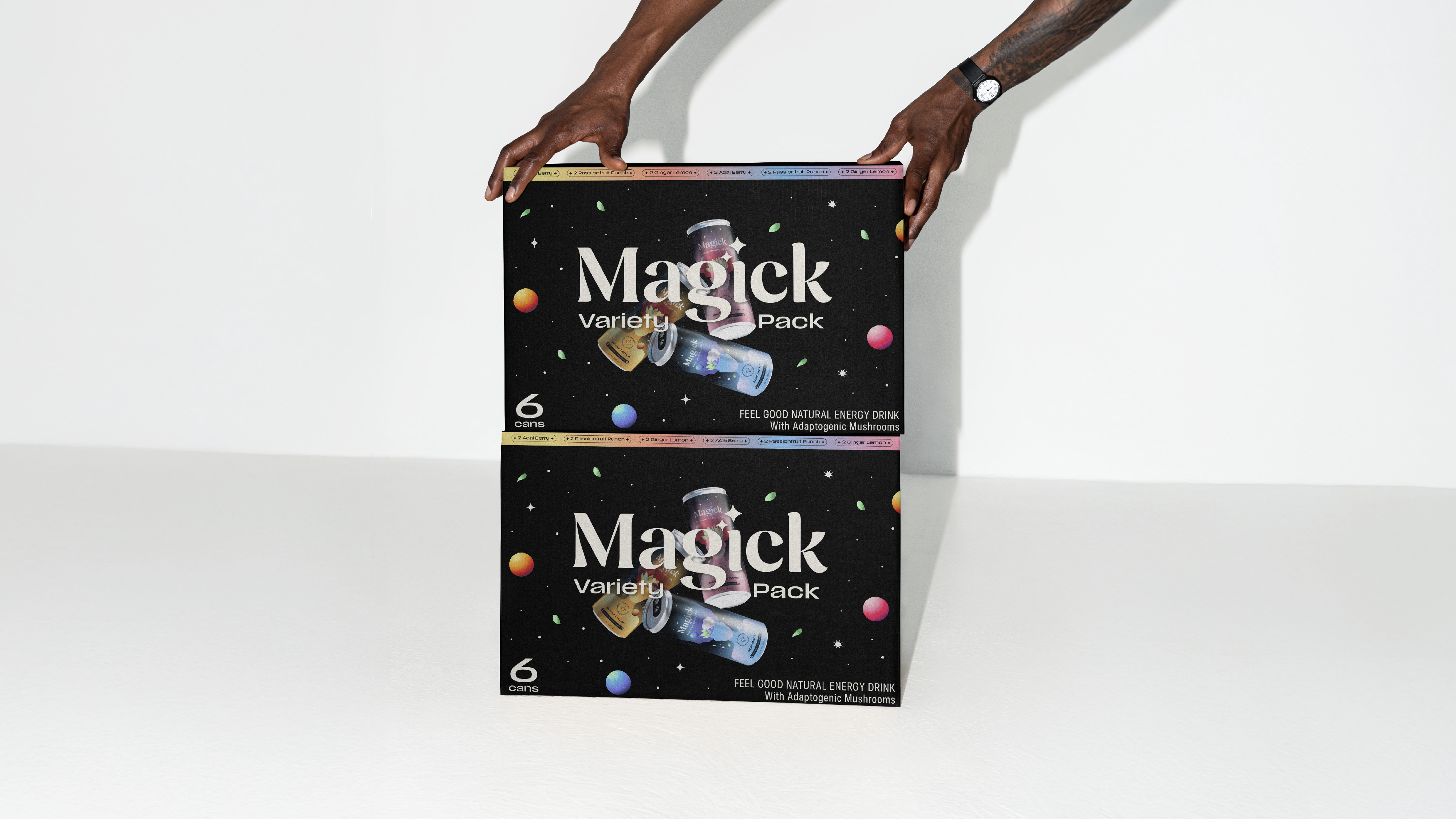
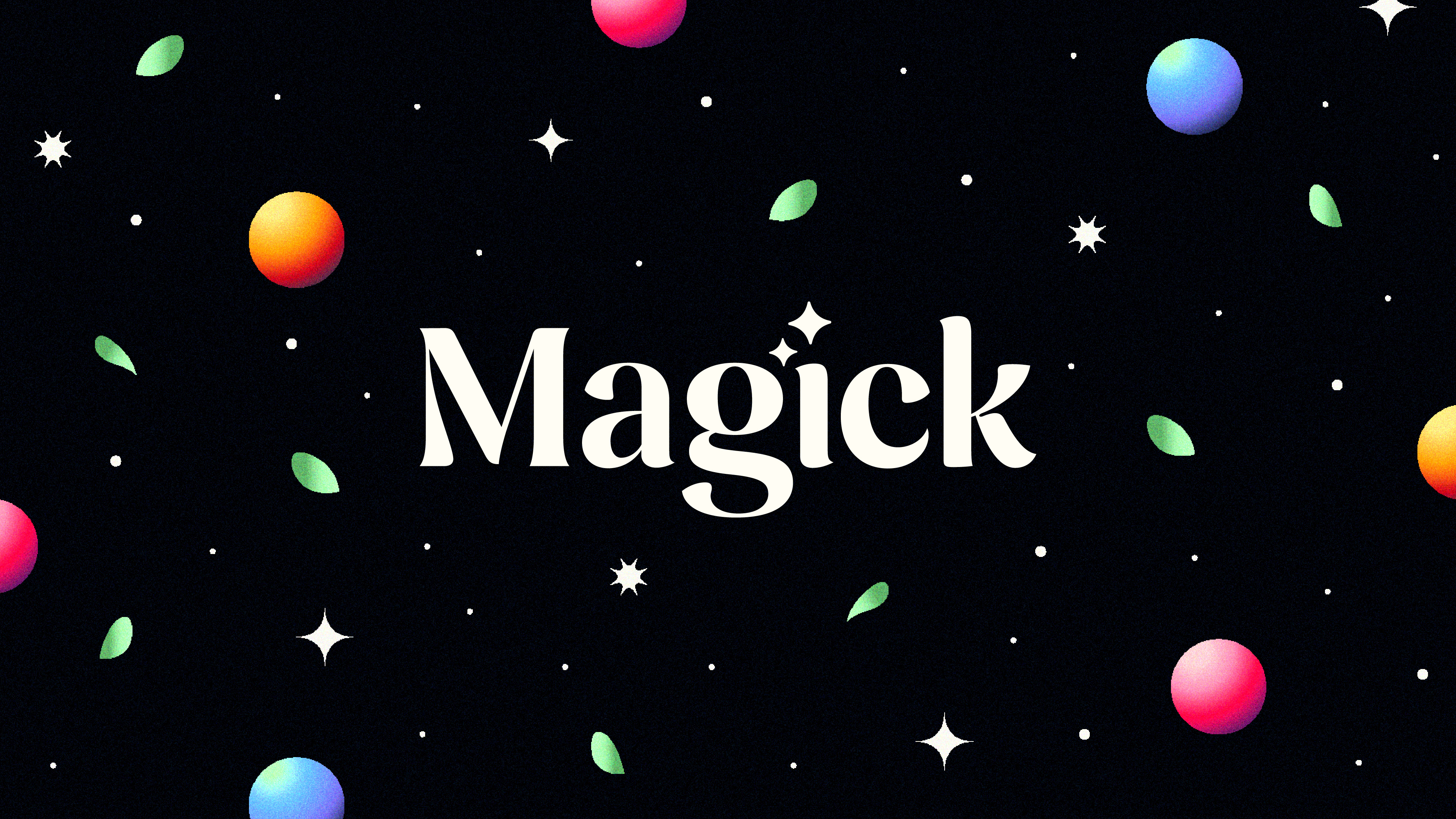
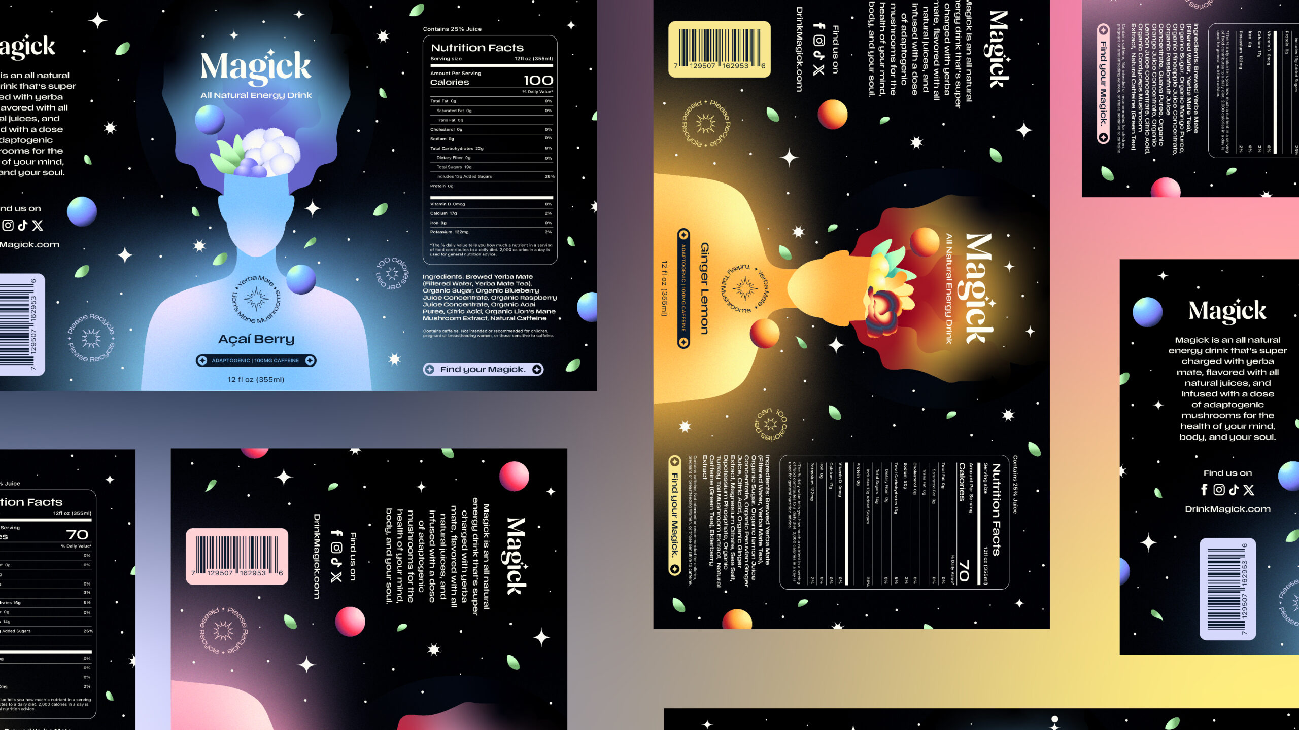
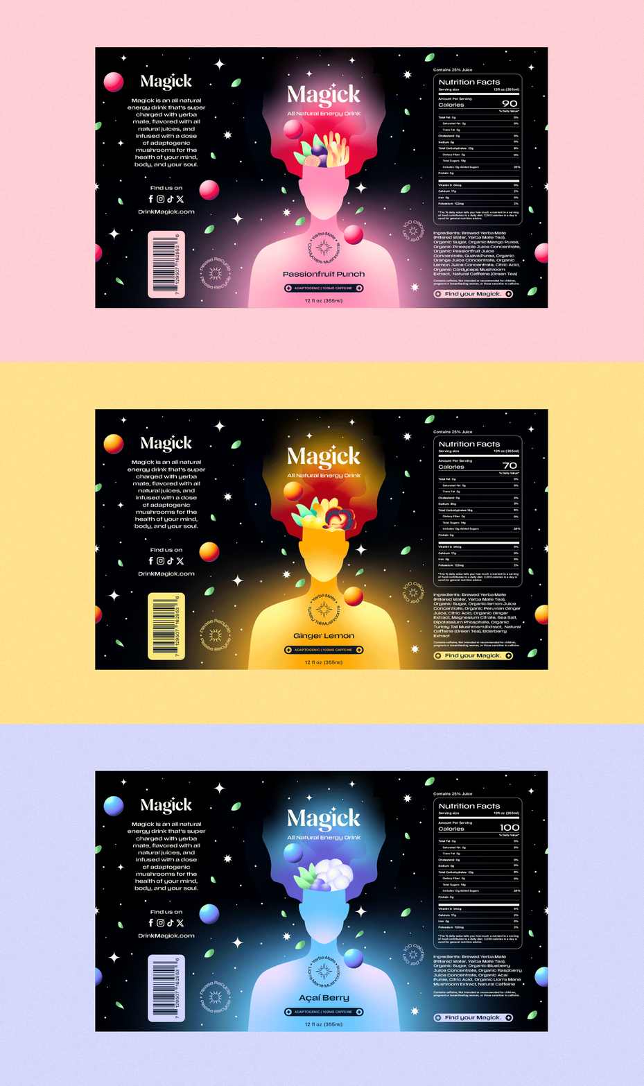
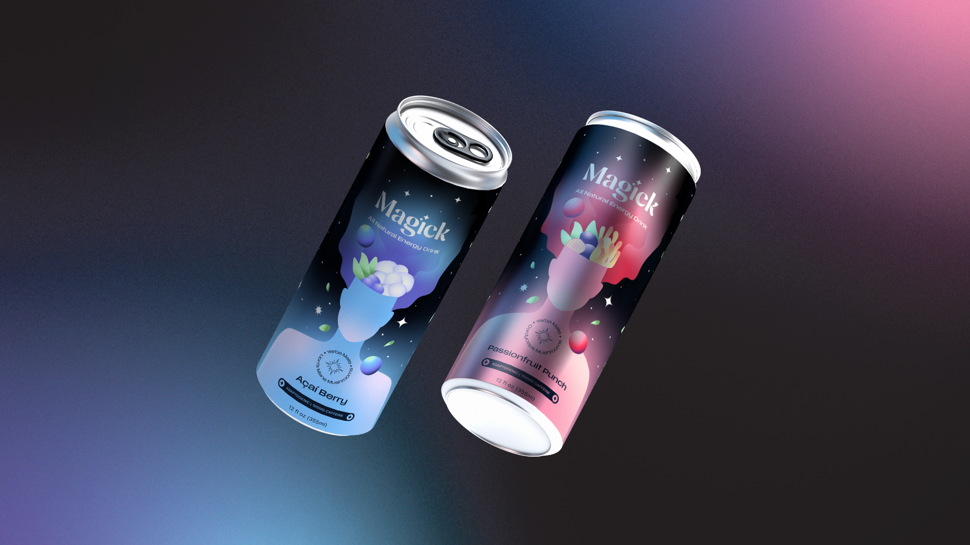
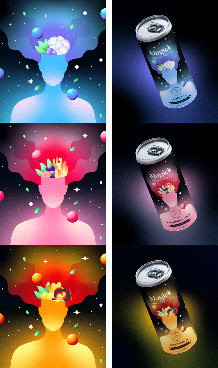
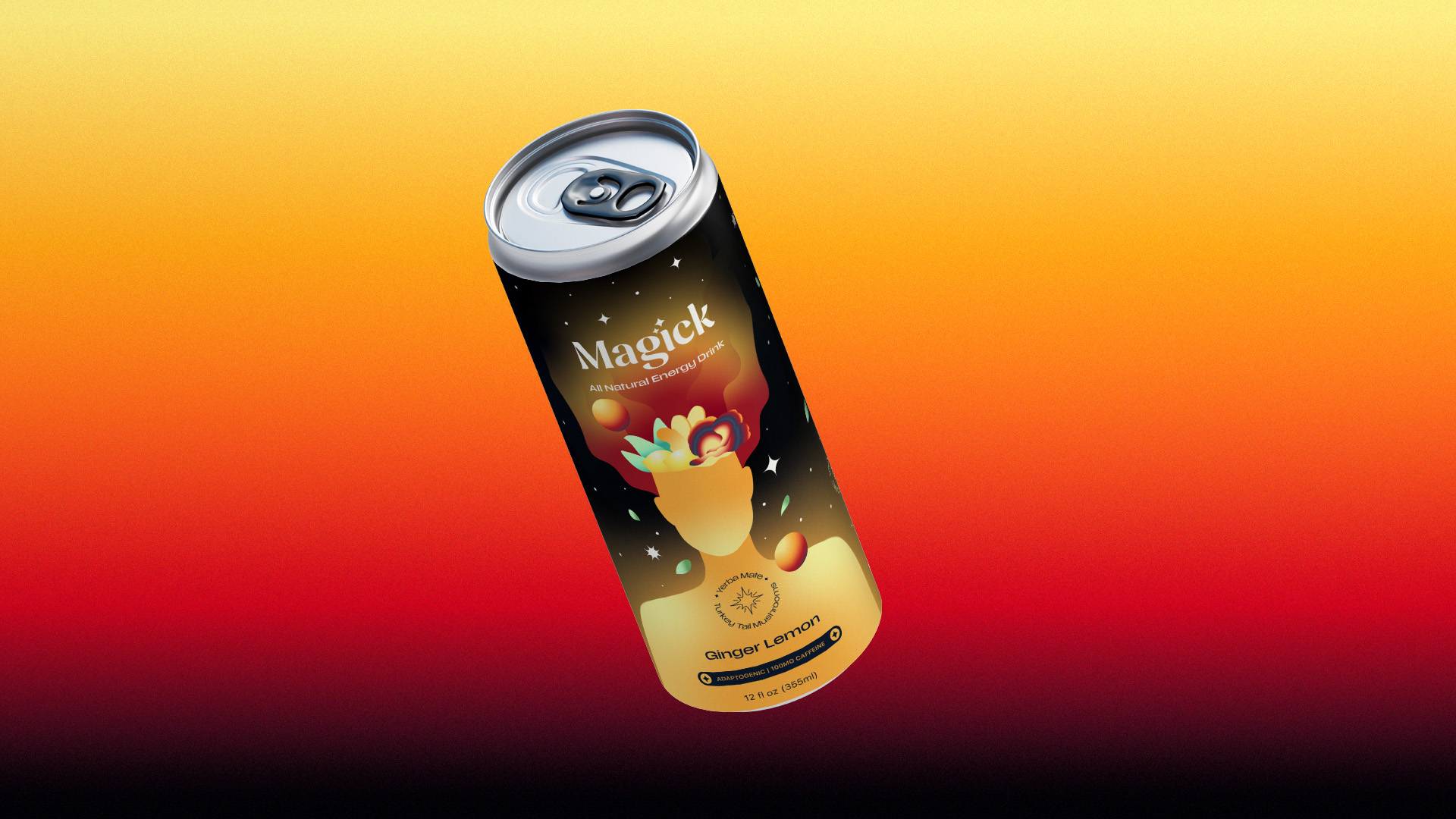
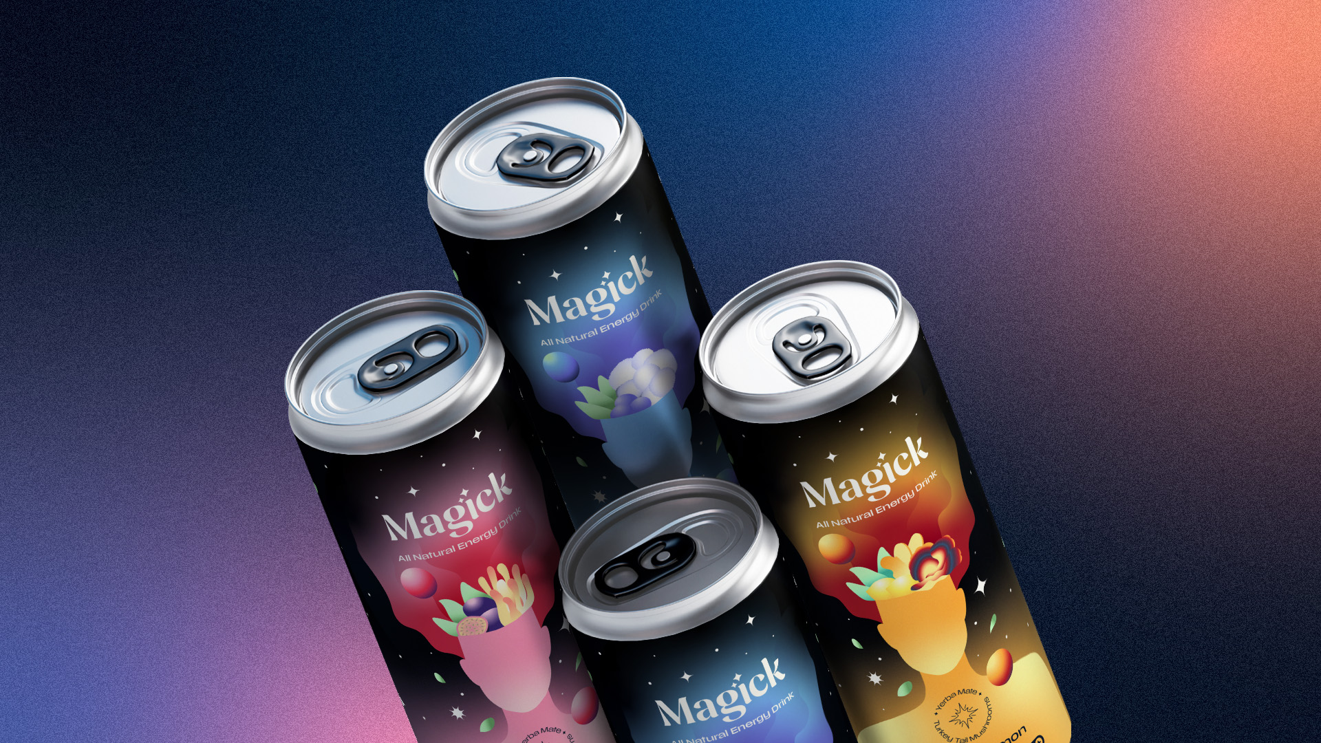
I knew illustration would be perfect for the brand, creating a magical and surreal energy to the drink along with speaking to our artistic and eccentric target market. The illustration is a human figure that personifies the feelings of euphoria and energetic lightness that you get when you drink Magick. The ingredients popping out of the head nods to the clean and functional properties of the drink and creates a clarifying and surreal experience for the consumer. I added leaves to the empty space along with planets and stars to remind the consumer of the natural ingredients in the drink. When you drink Magick, you feel blasted with goodness.
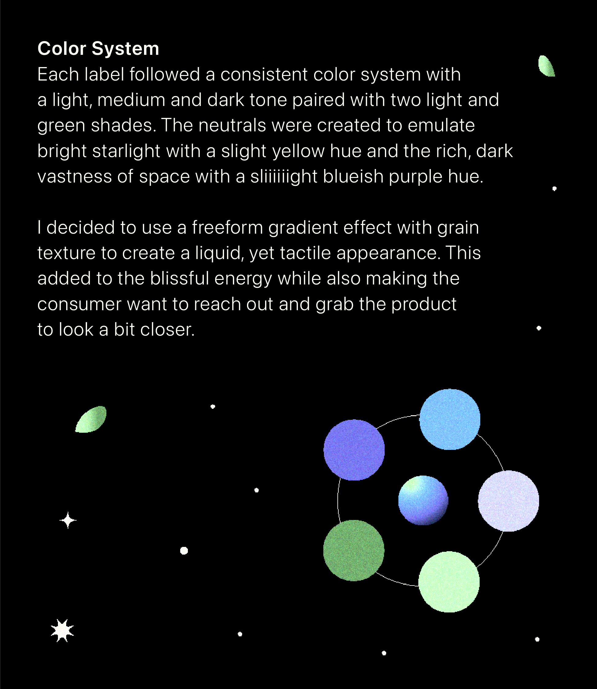
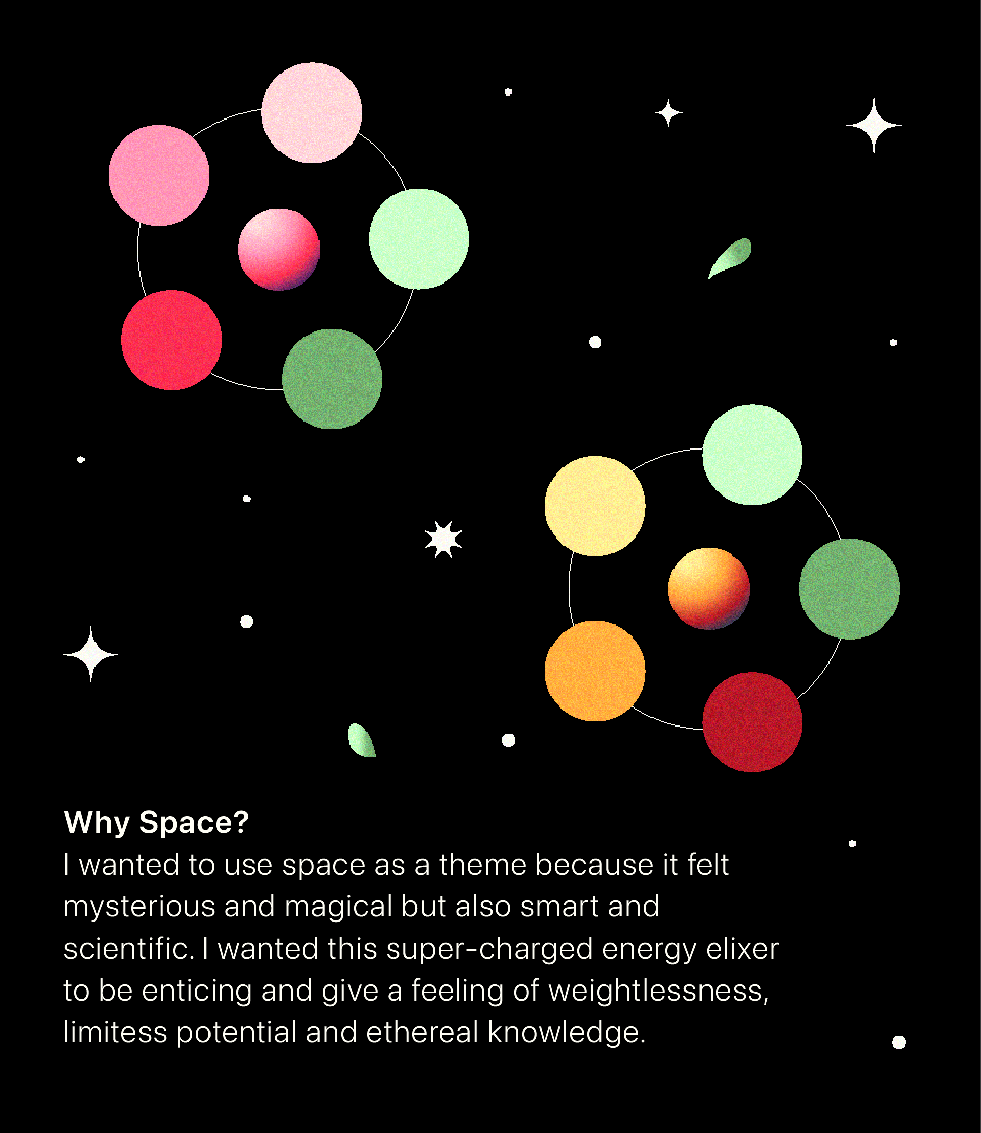
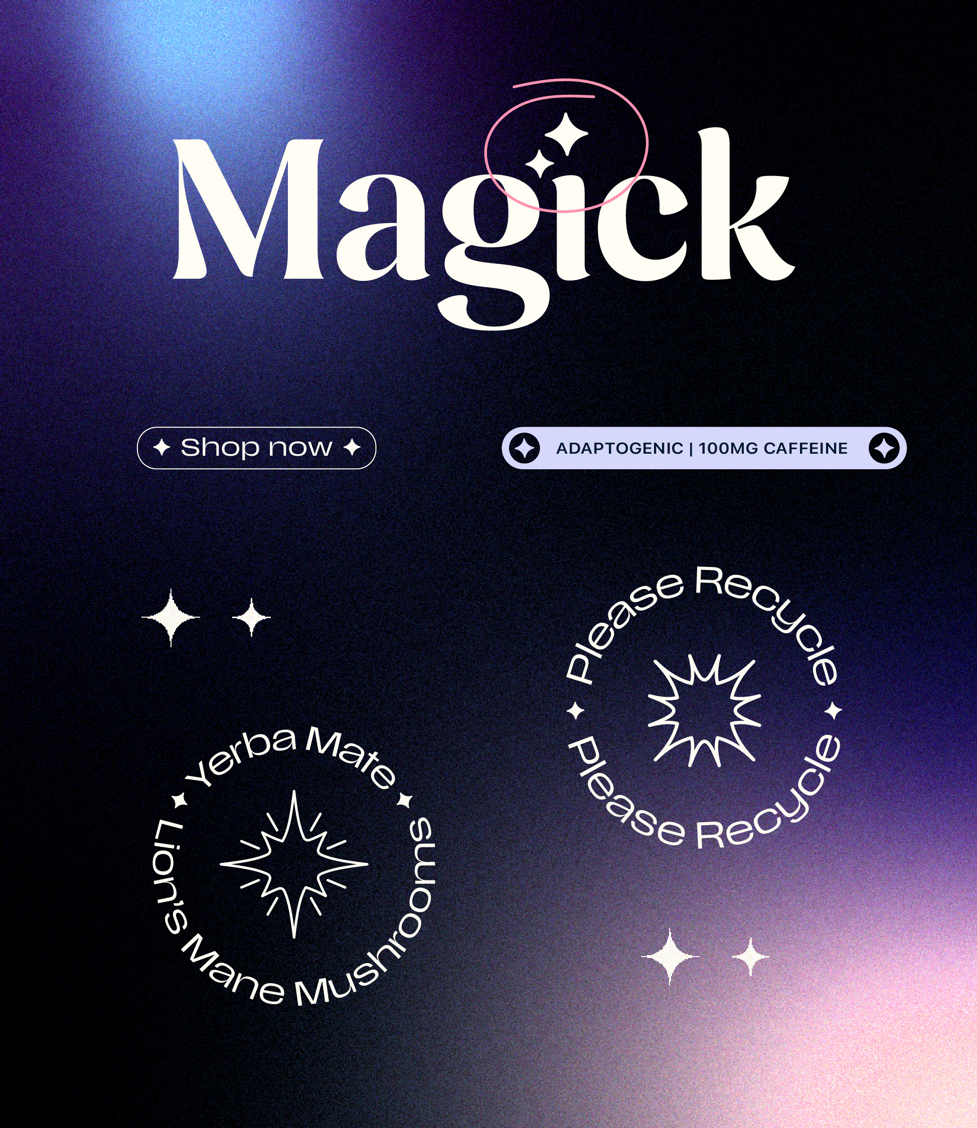
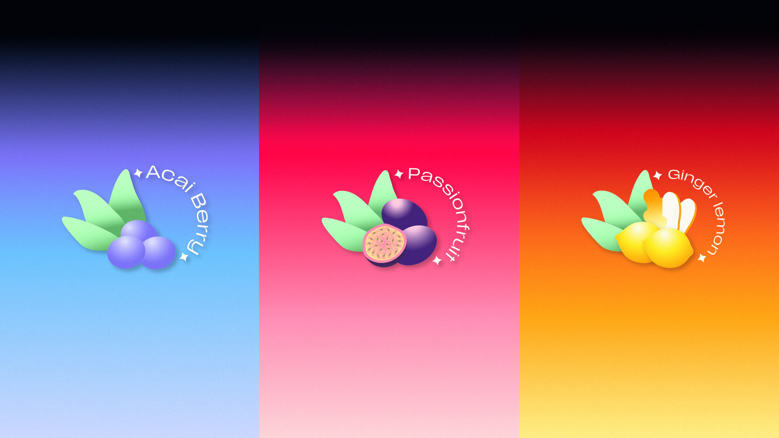
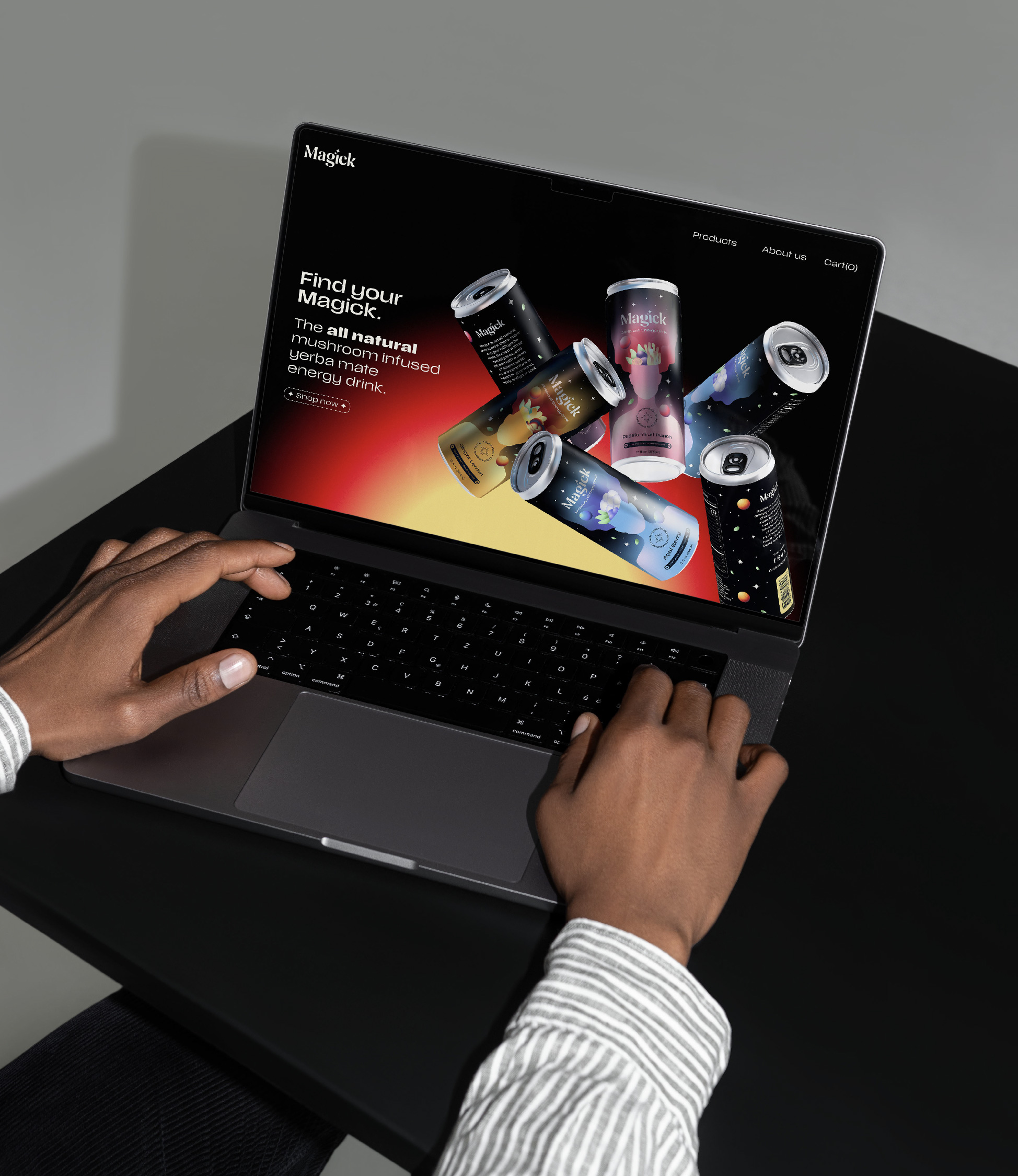
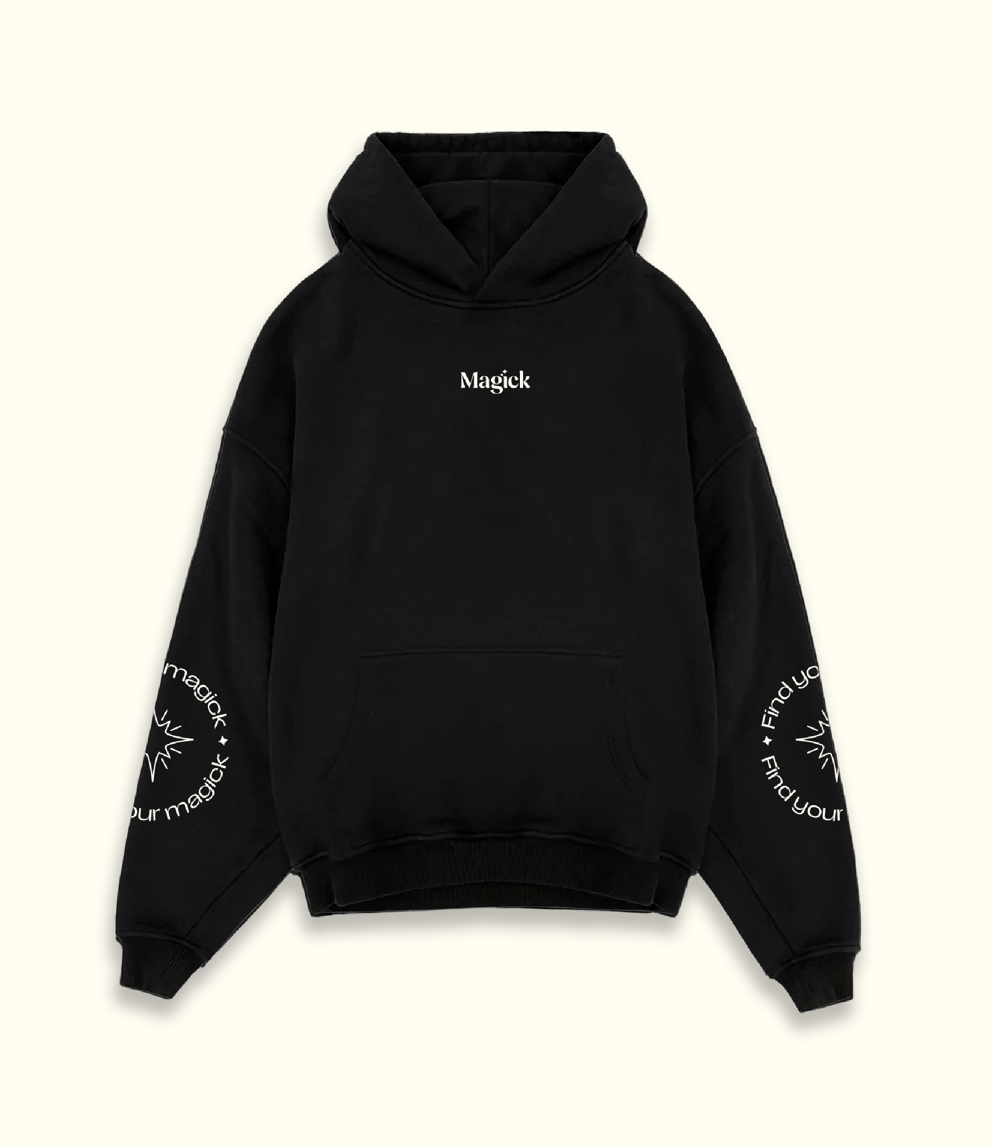
I didn’t want the brand to stop just at packaging. Where else does this brand live? How flexible is this design system? Though the packaging was dark, I didn’t want the brand to feel too heavy so with socials I mixed the brighter colors in the palette to create a more playful and energetic design. With photography I definitely wanted to show real ingredients and add some Magick flair to it. I found the stock photo on the left and felt it was perfect for the brand, including this rainbow prismatic effect that felt like it was made for Magick.
